Google Updates Its 'G' Logo For The First Time In 10 Years, Internet Has Mixed Reactions
One of the most instantly recognizable icons in the world of technology has just received a subtle facelift. Google has quietly updated its iconic multicolored "G" logo, marking the first significant visual change to the emblem in nearly a decade.
A Shift from Bold to Gradient
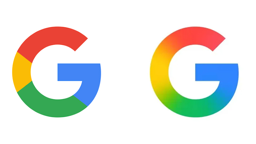
The previous "G" logo, introduced in 2015, featured four bold and solid colors—red, yellow, green, and blue—arranged in clean, blocky segments. This design was part of a larger rebranding that coincided with Google’s adoption of the Product Sans typeface and its broader push toward modern, mobile-friendly aesthetics.
Now, the new design introduces a gentle gradient effect within the same familiar color scheme. The change is subtle at first glance, transitioning smoothly from one color to the next, giving the icon a more dynamic and contemporary appearance. The updated logo aligns more closely with Google's design language seen in recent products, most notably the gradient-infused branding of its Gemini AI.
Where Can You See the New Logo?
As of now, the gradient "G" logo is live in specific places. Users of the Google Search app on iOS and those with Pixel smartphones running Android are among the first to experience the updated look. However, the redesign has not yet rolled out universally. On other Android devices and in web browsers, the older flat-color icon still remains in use.
Internet Reacts: Memes, Criticism, and Praise
As is often the case with visual overhauls from tech giants, the internet had a lot to say about Google's minimalist update—much of it humorous, some of it critical, and a fair bit supportive.
On X (formerly Twitter), users expressed mixed reactions. Some poked fun at the extremely subtle nature of the change, joking that it looked like the old icon had just been blurred or that they had “taken their glasses off.” One viral comment read: “Imagine how many PMs, designers, meetings, committees, and time was spent on adding a gradient to Google's new logo.”
Another user quipped: “Google app rebrand — Whatever you paid those designers, I would've done it for way less.”
Others were less amused and found the redesign underwhelming or unnecessary. Comments ranged from “What have they done???” to “The old logo is better.”
Still, not everyone disliked the shift. A growing number of users have shown appreciation for the updated icon, calling it “sleek,” “modern,” and a better fit for today’s visual trends. Supporters noted that the gradient brings a sense of depth and fluidity that feels more in line with Google's evolving product ecosystem.
Design Evolution: From Desktop to Devices
Google’s decision to redesign its logo back in 2015 was part of a broader strategy to make its branding adaptable to various device sizes, resolutions, and user interfaces. At the time, the company said:
"We’ve taken the Google logo and branding, which were originally built for a single desktop browser page, and updated them for a world of seamless computing across an endless number of devices and different kinds of inputs."
This approach continues today as Google expands its offerings beyond search into artificial intelligence, smart devices, and cloud services. The new gradient logo is already featured on Google’s physical signage at offices and on newer devices like the Pixel 9 smartphone.
What’s Next?
As of now, Google has not officially commented on whether the gradient design will become standard across all platforms and services. It remains unclear whether other flagship apps—such as Gmail, Google Maps, or Google Drive—will receive similar design updates.
Despite the quiet rollout and polarized opinions, this small visual change reflects a broader trend in tech branding: subtlety, fluidity, and adaptability in an increasingly digital and AI-integrated world.
Whether you love it, hate it, or didn’t even notice it, one thing is certain—Google’s brand continues to evolve, even if it’s one pixel at a time.


Comments
Post a Comment